Digital Strategy & Experience Redesign

Me Oh My Coffee and Pie

Driving community engagement and online order growth through cohesive rebranding, user-centered design, and ongoing marketing campaigns.

My Role

UX Designer & Researcher

Duration

August 2024- present

Tools

Figma, Weebly, Square Online, Google Analytics, Google Search Console, Maze

Overview

The Problem

Two locations, one confusing digital presence

Customers were confused by two distinct locations with different inventories, and the owner lacked a streamlined system to update seasonal offerings. That friction, the owner told me, cost sales and diluted the shop's warm, local brand identity.

Two locations, one confusing digital presence

Customers were confused by two distinct locations with different inventories, and the owner lacked a streamlined system to update seasonal offerings. That friction, the owner told me, cost sales and diluted the shop's warm, local brand identity.

Solution

A redesign built for the owner as much as the customer

A comprehensive digital strategy combining a website redesign with a shared palette with one lead color per location to create clear location specific-user paths,and a common typeface across all sites. The work has expanded beyond the initial redesign into sustained brand and marketing support.

A redesign built for the owner as much as the customer

A comprehensive digital strategy combining a website redesign with a shared palette with one lead color per location to create clear location specific-user paths,and a common typeface across all sites. The work has expanded beyond the initial redesign into sustained brand and marketing support.

Research

I talked to customers before I touched a single pixel.

I ran two rounds of research. The first was discovery: six semi-structured interviews conducted in-person at the shop and remotely, with participants ranging from their mid-20s to mid-70s and included users who identify as neurodivergent. I also interviewed the owners directly to understand their operational pain points, not just the customer-facing ones.
From there, I built three personas representing the shop's real customer base: community regular, new arrival, loyal regular.

I talked to customers before I touched a single pixel.

I ran two rounds of research. The first was discovery: six semi-structured interviews conducted in-person at the shop and remotely, with participants ranging from their mid-20s to mid-70s and included users who identify as neurodivergent. I also interviewed the owners directly to understand their operational pain points, not just the customer-facing ones.
From there, I built three personas representing the shop's real customer base: community regular, new arrival, loyal regular.

Design

Every decision traces back to a finding.

The research pointed to one core problem: users couldn't quickly get where they needed to go across a technically fragmented system. So the redesign focused on building a clear front door that absorbed the complexity so customers never had to feel it.

Working within the existing infrastructure.

Rather than migrating the owners off their Weebly homepage and Squarespace commerce sites, I redesigned the Weebly site to act as a clear entry point that oriented customers and routed them to the correct Squarespace site for their location. The owners kept every system they were already comfortable with. The complexity of navigating between platforms became invisible to the customer.

CTAs above the fold.

Direct links to each location's Square ordering site moved to the homepage hero. The most-used actions became the first thing users see, with no hunting required.

Simplified navigation for all users.

Addressed several WCAG 2.1 AA criteria directly: color contrast, descriptive alt text, non-color-dependent location cues (so the color-coded locations also carry a text label), descriptive link and button text, consistent navigation, and plain-language content shaped by interviews that included neurodivergent users.

Designed around the owner's reality.

Rather than building a dynamic menu system that would require regular staff updates, we made a strategic decision together: replace seasonal menu management entirely with a permanent Everyday Menu showcasing the core offerings that remain consistent year-round. That menu lives prominently on the homepage, giving customers immediate confidence in what's available. Seasonal and specialty items moved into a dedicated social and email marketing cadence, where they can be promoted with more context and creativity than a website menu update would allow anyway.

Results

Here's how it held up in the real world.

Online orders rose 38% in the months following launch, once the initial numbers settled. The first month alone saw orders more than double the month before; even after that spike faded, monthly orders never dropped back to the pre-launch level again.

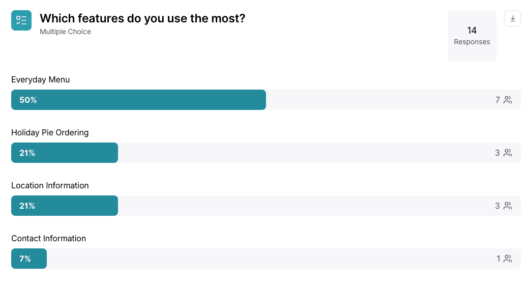
Maze post-launch surveys confirmed the navigation decisions

A post-launch Maze study checked the redesign against real behavior: 50% of users engaged most with the newly surfaced Everyday Menu, confirming the navigation change and setting priorities for the next iteration.
One thing I'd do differently

I didn't set up Google Analytics before the rebrand, which meant I was measuring from a new baseline rather than against historical data. That's a process change I've already built into how I approach new projects.

What's Next

Ongoing optimization as the business and brand continue to grow

This is an active, ongoing engagement. Work continues across seasonal content updates, marketing campaign design and implementation, and monitoring of Google Analytics and Square dashboard data to inform the next round of decisions.